Back

Back

Boston Consulting Group

Enhancing the entry point on BCG.com for better engagement and new business

Enhancing the entry point on BCG.com for better engagement and new business
BCG drives change worldwide, but its homepage doesnt reflect that impact. To attract new business, the experience needs to be more engaging and strategically designed to guide users deeper into the site.

Web Design

Web Design

Content Management System

Content Management System

User Research

User Research

TL;DR ↓

The Ask

Deliverables

Redesigned
the homepage for BCG.com
For
prospective clients and internal employees
To
improve the page’s content and visual design
To
introduce new flexible CMS modules

TL;DR ↓

The Ask

Deliverables

Redesigned
the homepage for BCG.com
For
prospective clients and internal employees
To
improve the page’s content and visual design
To
introduce new flexible CMS modules

TL;DR ↓

The Ask

Deliverables

Redesigned

the homepage for BCG.com

For

prospective clients and internal employees

To

improve the page’s content and visual design

To

introduce new flexible CMS modules

Outcomes

Outcomes

10%
10%

10%

decrease in the page's bounce rate

decrease in the page's bounce rate

14%
14%

14%

increase in new account sign ups

increase in new account sign ups

2
2

2

new phases of work engaged

new phases of work engaged

My Impact

My Impact

Designed
effective modules within tight CMS constraints

Designed

effective modules within tight CMS constraints

Synthesized
research into actionable design insights

Synthesized

research into actionable design insights

Proposed
a new account flow that boosted sign-up rates

Proposed

a new account flow that boosted sign-up rates

Additional Project Details

/ About the project

At Boston Consulting Group, my team was tasked with redesigning the firm’s homepage. The goal was to enhance the user experience, refresh the visual brand, and introduce new modules to guide users deeper into the site’s content.

/ Credits

Lead:

Cecilia Villegas Nava

Designers:

Johana Jimenez, Self

Project Manager:

Kevin Caldwell

/ timeframe

3 months

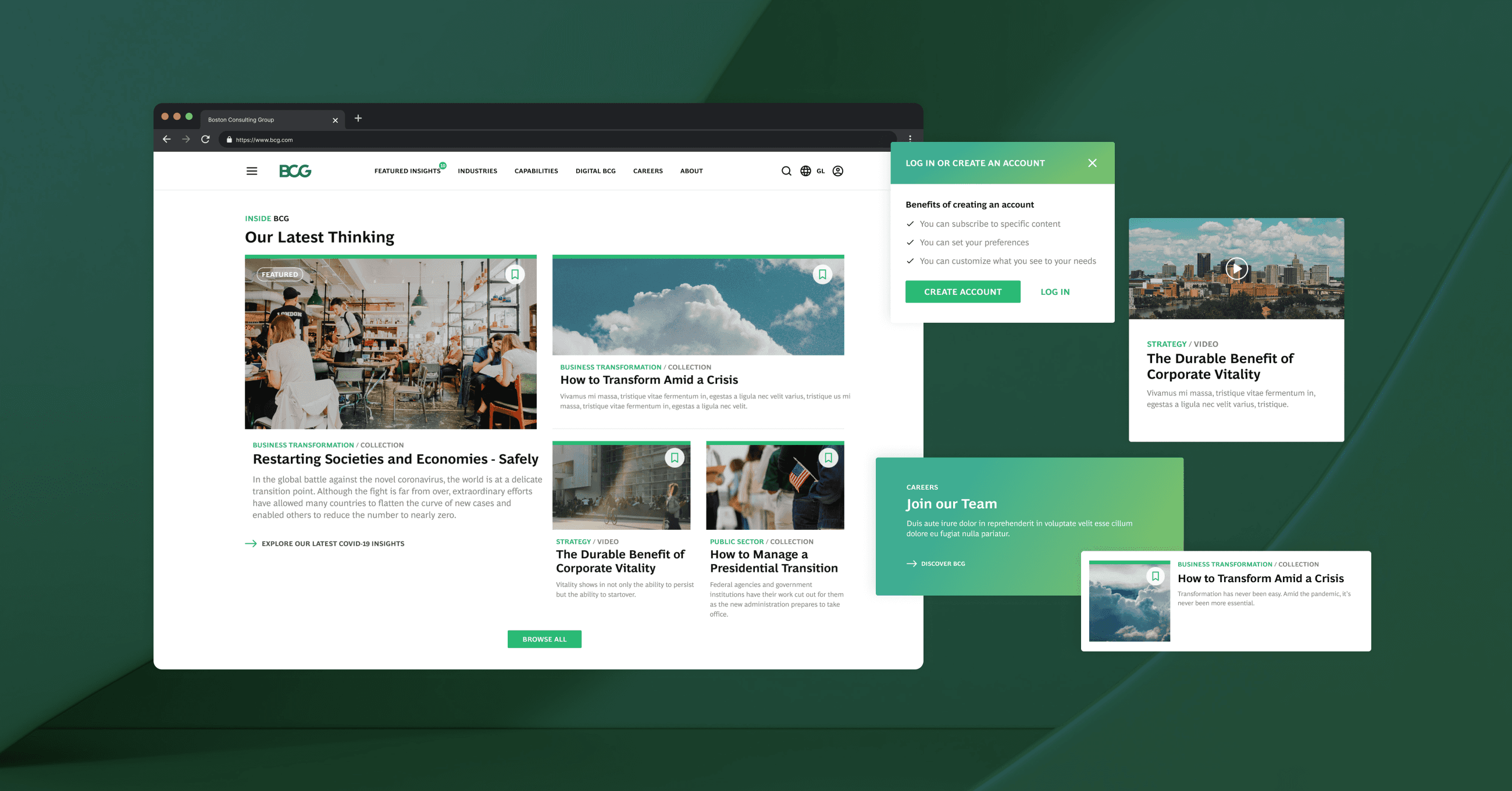
Final design proposed for the returning user, leveraging personalization and tailored content

Module designed to highlight internal marketing campaigns

Module prompting users to discover the insights section of the website

Understanding our audience and their needs

Our first step was to understand who visited BCG.com and what they were looking for. We collaborated with the marketing team through several workshops, crafting user narratives for different types of visitors. These narratives helped us determine the key content that should be highlighted on the homepage and revealed gaps where new modules could enhance the experience, such as offering more customization for specific users.

Snippet of UX documentation where we mapped out the different user types and their goals

Improving legibility and scannability

Improving legibility and scannability

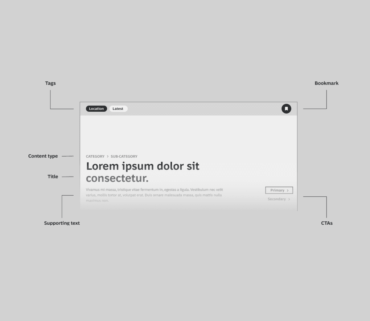
With a clear grasp of business goals and user needs, we reviewed the existing homepage modules. We focused on improving color usage and simplifying the type hierarchy to make the content easier to scan and digest. This new design aimed to make key information more accessible and scannable.

Before and after comparisons showing our proposed improvements to the existing modules

/ deeper look

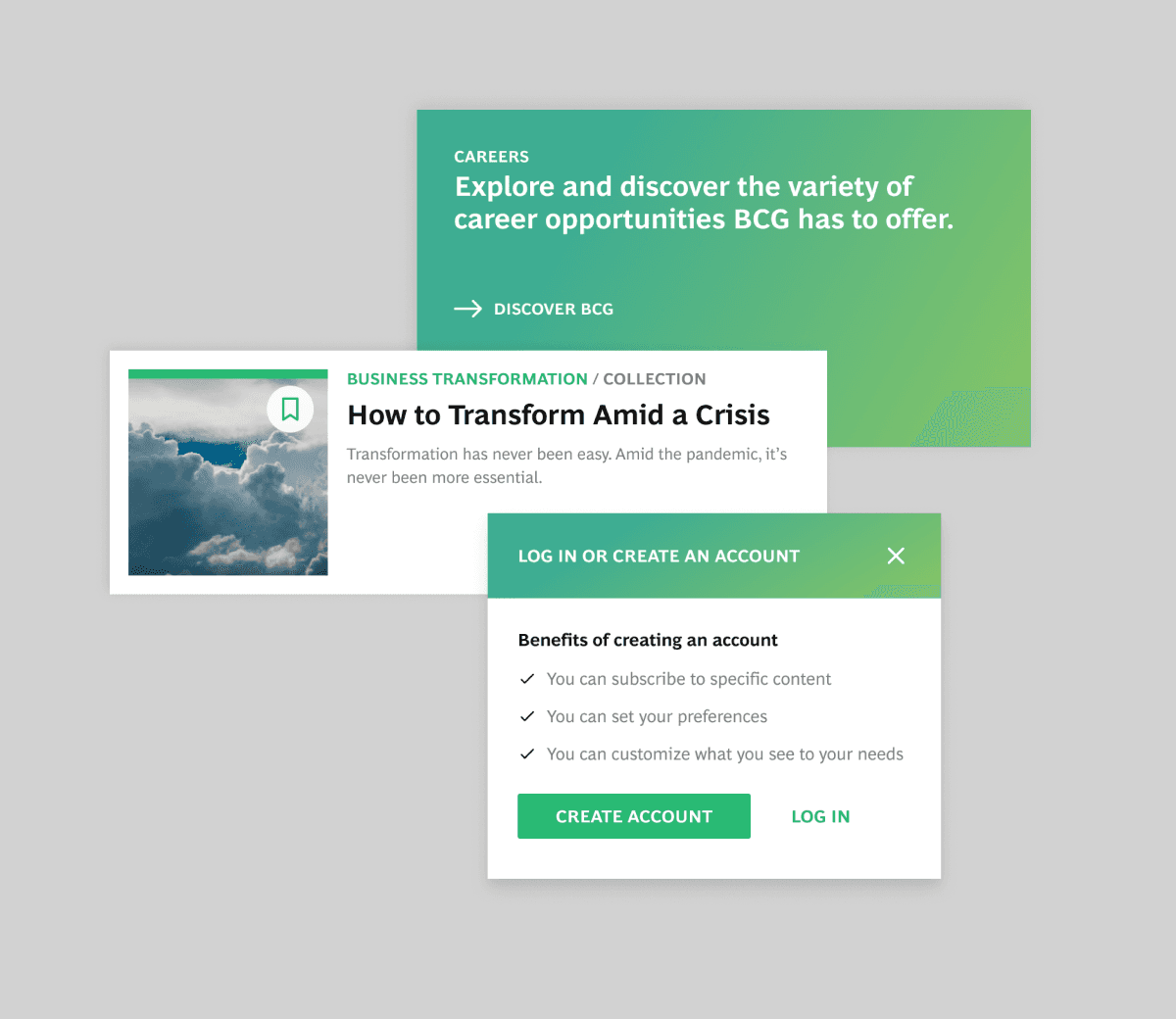
A critical success metric was increasing account sign-ups. We tested different approaches and implemented a bookmarking feature. This feature allowed users to save articles, prompting new users to sign up to access the feature. As a result, account sign-ups increased by 14%.

Proposed bookmarking interaction that increase account sign ups by 40%

Introducing new modules to drive site exploration

One of the main goals of the homepage was to encourage users to explore other areas of the website. We introduced a new module that showcased BCG's practice areas in one view, allowing users to easily navigate and dive deeper into insights related to their interests. This module significantly increased engagement with BCG’s various expertise areas.

Insights module that allows users to view tailored content, driving deeper exploration into other sections of the website.

Challenges & Improvements

Challenge

Challenge

Challenge

Redesign only one page

The main challenge was redesigning only the homepage while maintaining cohesion with the rest of the site. This required introducing new design elements while preserving consistency with BCG’s broader visual identity.

Improvement

Improvement

Improvement

Merging new and old

To address this challenge, we closely studied the design of the rest of the website, identifying specific qualities such as color schemes, typography, and imagery. We incorporated these elements into the new homepage design while adding subtle gradients and refined tweaks to modernize the look and feel. This approach allowed us to create a fresh yet cohesive homepage that aligned with the broader site.

Optimizing for Future Flexibility

To ensure long-term scalability, we created a flexible system of modules that consisted of multiple variants for high-priority modules. We provided detailed documentation in Figma, outlining how the modules could be reused and adapted for future updates, empowering the marketing and development teams to make consistent changes.

Documentation for engineers and marketers detailing the new module strategy and how to best use it

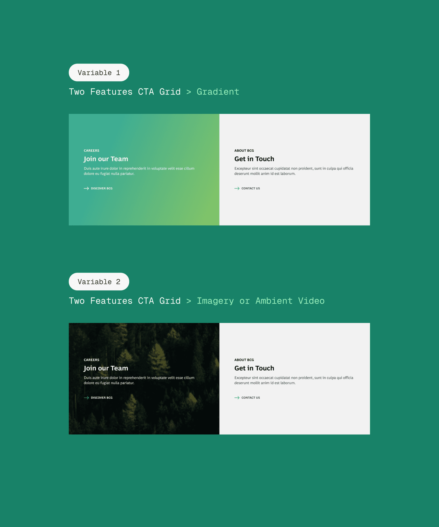
Example of UI variants we provided for each module

Overview of Figma handoff documentation given to engineers

Outcomes

0%
0%

Decrease in the page's bounce rate

8%
8%

Increase in new account sign ups

0
0

New phases of work engaged after the completion of this work

Get in touch

Say hi

hello@valeriaconty.com

Available for work

2025

Get in touch

Say hi
hello@valeriaconty.com

Available for work

2025

Get in touch

Say hi
hello@valeriaconty.com