Juno Bio

Quick snippet of original dashboard justaposed with new screens of the experience
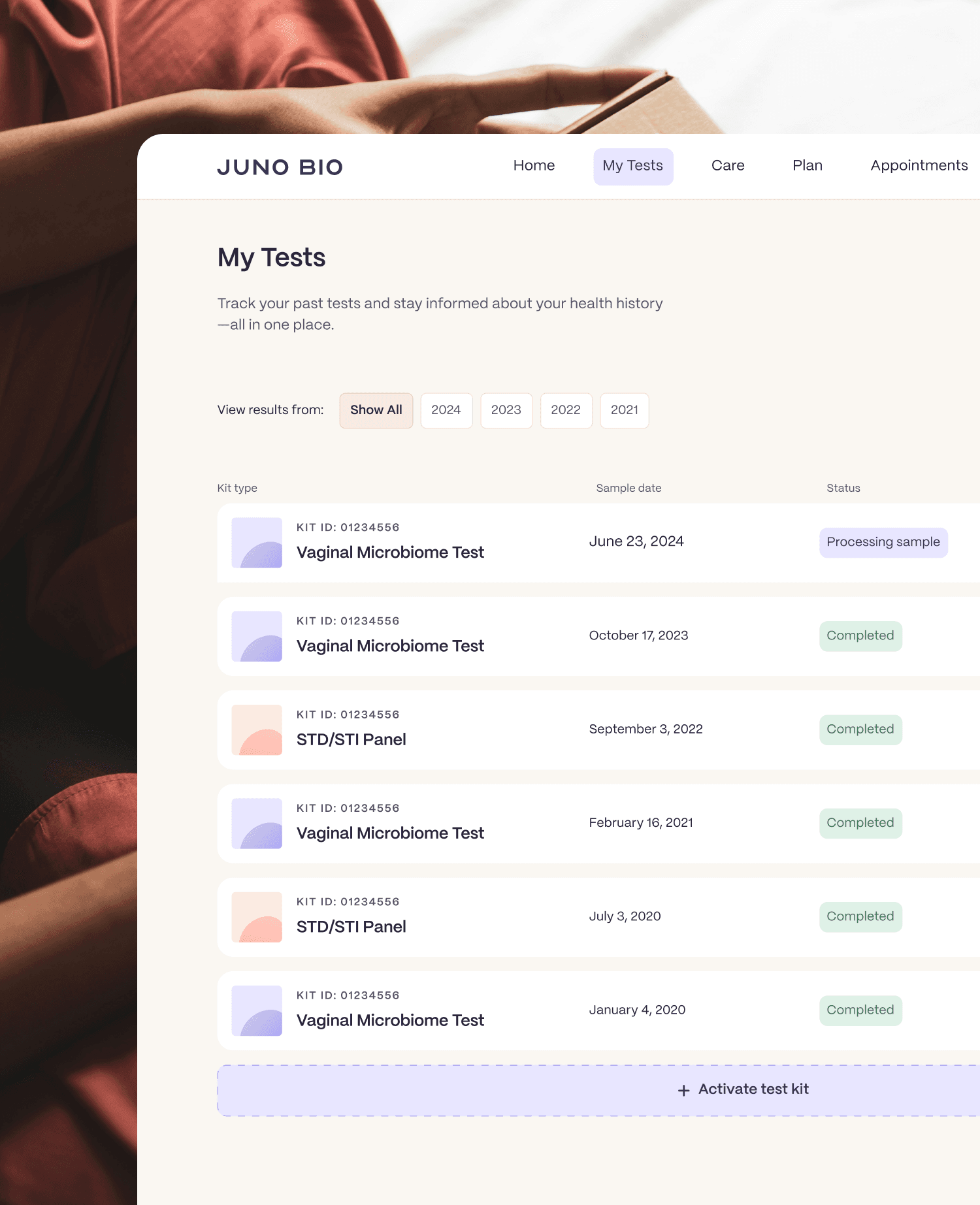
Overview of test kit history and orders
Flexible card components adapting to different patient journeys
Making health data more accessible
The patient report is the core of this experience, helping users interpret their microbiome data with ease. To improve clarity, we explored various data visualization styles, introduced interactive elements like accordions and cards, and optimized content for mobile. The result? A more intuitive, digestible report.
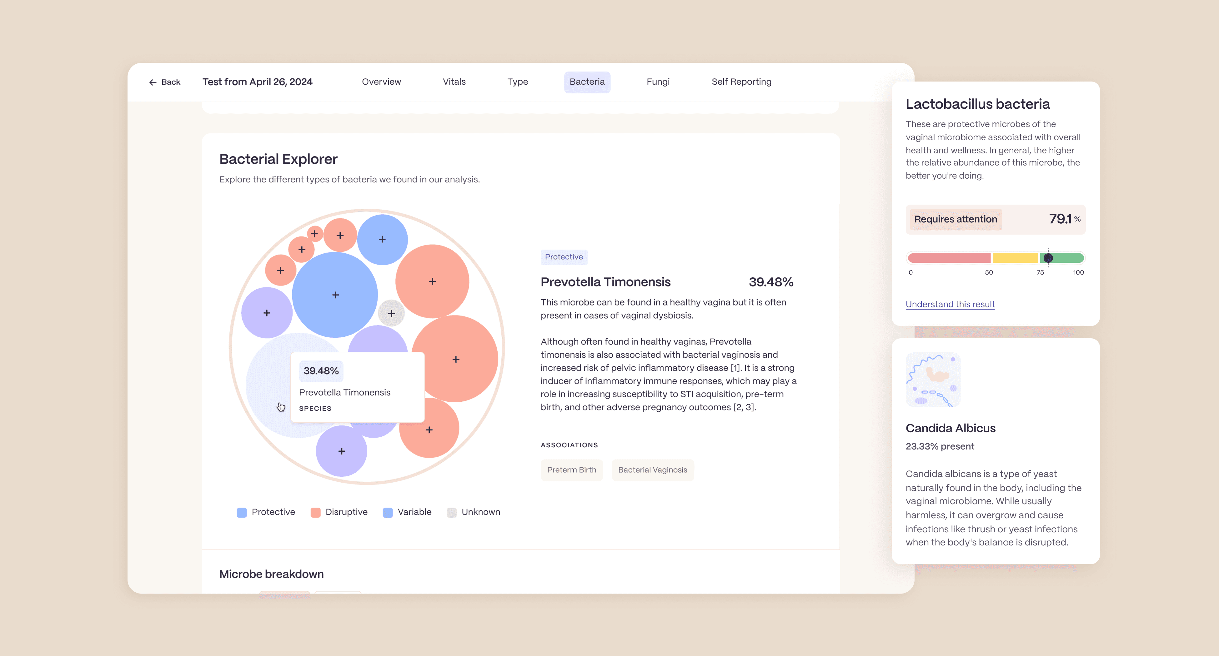
Interactive report snippets visualizing bacterial composition results
Treatment plans needed to feel personal while remaining clear and actionable. We designed components that outlined treatment details concisely while incorporating human elements: such as medical team highlights and personalized goals to reinforce trust and support.
Key journey components aligned with their intended goals
/ deeper look
No two patients are the same. Some have a single test kit, while others have a complex history of results and treatments. To accommodate varying needs, we built a flexible design system. The progress tracker, for example, was designed to scale, expanding for more complex cases while staying simple for those with a straightforward path.

Progress tracker designed for patients with multiple active test kits
Simplifying the path to conversion
Once the treatment plan experience was defined, we streamlined the journey from receiving results to purchasing a treatment plan. Through iteration, we developed a step-by-step flow: educating patients on their options, collecting necessary information, and guiding them seamlessly toward enrollment.
Step-by-step flow guiding a patient to purchase a Care Plan
Challenges & Improvements

Finding the right place for care journey features
As we introduced telehealth and treatment features, we explored several navigation and information architecture structures to determine the most seamless way to surface this content. One early direction grouped treatment, appointments, and refills under a single “Care” tab in the side nav. However, after conversations with stakeholders, we found this approach to be confusing and unintuitive, especially for users who had tested but weren’t interested in a care plan.

Segmenting the experience with clear, intuitive labels
We restructured the navigation to reflect how patients actually engage with the product, regardless of whether they opt into care. Features like appointments and refills were surfaced in their own dedicated sections, making them easier to find. We also introduced contextually-placed CTAs on the dashboard to guide users toward renewing treatments without burying essential actions.
Refining the visual system to build trust
To enhance credibility and usability, we refined the visual hierarchy, spacing, and typography. We also revisited color choices and imagery, ensuring every design decision fostered trust and confidence in the platform.
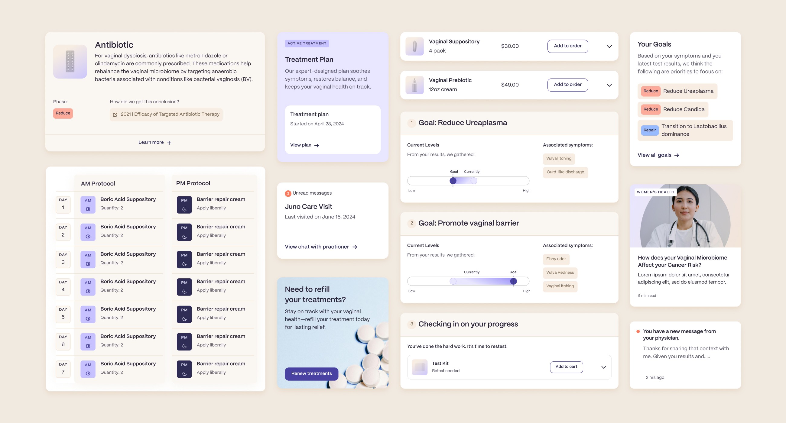
Selected UI components facilitating comprehensive care
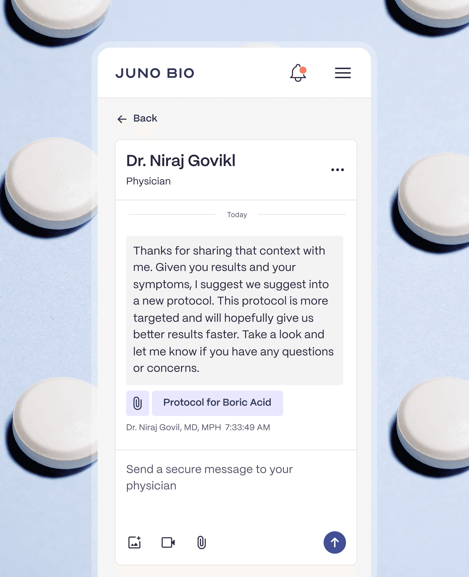
Conversation with a physician about a new protocol
Card displaying key insights within the patient report
Outcomes
Facilitated 10+ collaborative sessions with business stakeholders and engineering to align goals and execution.
Designed 60+ modular components to support diverse patient journeys with flexibility.
Delivered 3 project phases in collaboration with teams in the USA and London.